Welcome back to another installment of the Galactic Style Guide, the series where we break down the ‘Star Wars aesthetic’ in order to help you create a more authentic ‘outer persona’!
Like last time, this entry is a bit of a departure from our usual collection of references. This time we’re continuing to focus on elements which I’ve identified as either clear deviations from what existed in the Lucas days, or which originated firmly in the post-Disney era. Let’s keep it moving with #6!
When it comes to soft kit, after perusing the various Visual Dictionaries one trend I noticed started appearing with the Sequels and subsequently latched onto by fan-makers is that of little discrete loops (instead of pockets) being used to hold various doodads on clothing – your code cylinders, ‘mini flares’, blaster ammo, etc.:
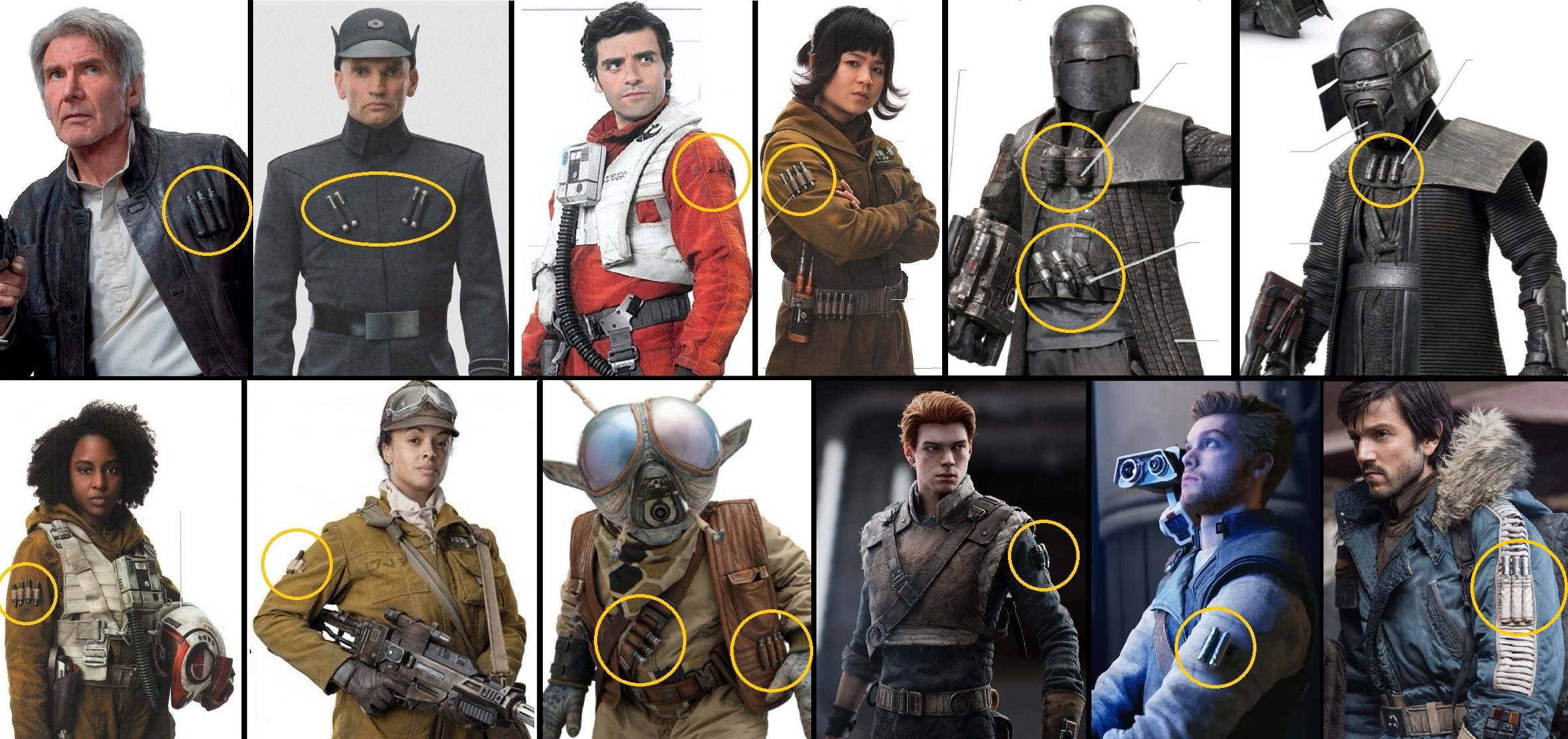
What I really want to know is why everyone in the new continuity seems to need so many of these little silver things anyway? In the OT, we’d see Rebel pilots and technicians with small ones on their belts, and big ones kept below the knee (Reb pilots and Bossk seemed to be just about it). But in the Disney era, they’re all over the place! In short, I think they’re a symptom of the new era costumings’ general reliance on overdesign, versus good design, which in the case of the Star Wars setting, usually boils down to Less is More. You don’t need to have every single visible surface sporting some sort of detail – it’s OKAY for costumes to have ‘blank space’! This is especially true in our crispy 4k UHD+ present, when it is all too easy for an overdesigned outfit to leave the viewers’ eyes overwhelmed.
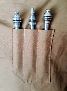
Plus, whenever I see cosplayers and Batuu-bounders using these post-Disney loops to carry ‘code cylinders’, they always stick out at odd angles and wind up looking generally wonky. I whipped these up to show what I mean:

Considering they’re really only seen onscreen carried by enlisted members of the Alliance and Imperial military (see above), perhaps first consider if such devices are actually appropriate for your character – and then, follow uniform regs and stick them in a pocket where they belong!
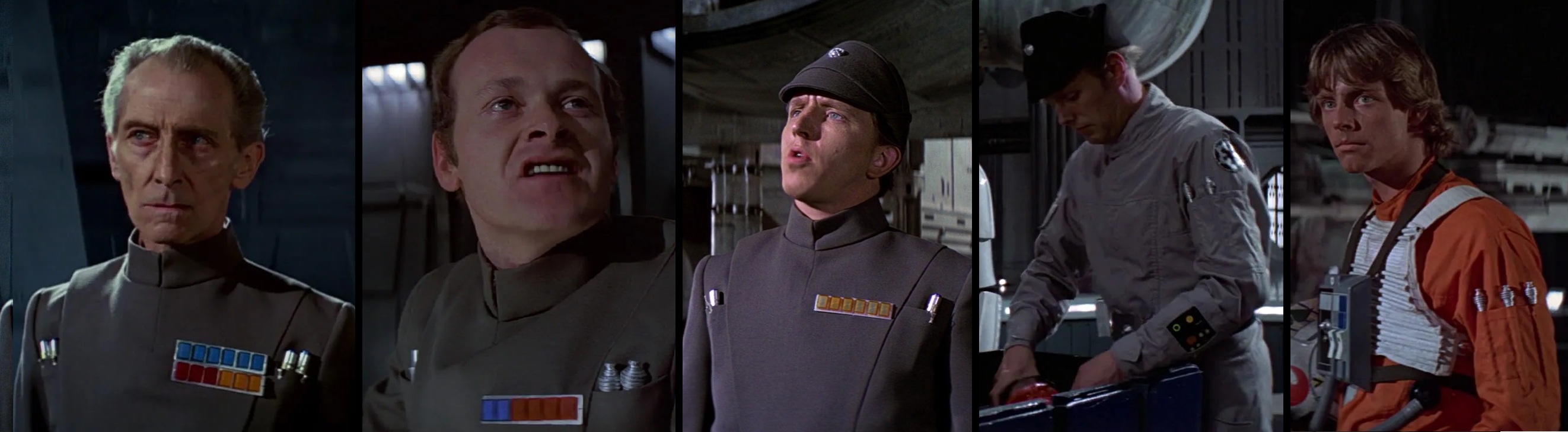
#7: As we touched on back during 2022’s Aurebesh Month, we do also tend to see more text on clothing and gear in the post-Disney titles. As in the EU, one place this actually makes sense is for denoting incarcerated individuals – the only time in-universe you’ll see a character with three-inch characters down the front of their outfit!
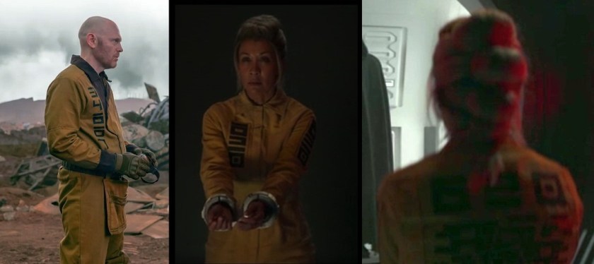
Most other times, however, the text is pretty superfluous and its function would be served some better way – i.e., usually some sort of insignia.
As you can see above, one of the key visual differences between the Empire of the OT and these new ‘First Order’ sequel baddies is the lack of OT-style rank plaques with the latter; the sequel visual dictionaries can’t decide if their ranks are shown by the tube-things in their chest-loops, or by these wristbands that say things like ‘Tarkin’, ‘Dillon’, and ‘Power’ or whatever (high-ranking evil characters I guess?) – just like WW2-era German forces had commemorative wrist cuffs with the names of uncle Adolf or Goring or whomever.

The thing is, those were honors, not the wearer’s actual rank – something which really ought to be readily apparent without having to read the cuff of someone’s jacket; chest rank plaques just make sooooo much more sense. Furthermore, these ‘First Order’ things bug me because they’re just too on-the-nose: OT Imps’ design worked because their design had subliminal Nazi DNA in it – not because John Mollo just took Nazi elements and ported them over 1:1 to GFFA.
However, the good guys aren’t immune to the pitfall of sartorial text either:

As I’ve discussed before, Star Wars is a very visually-iconic setting, so it’s goofy to see text used to designate a character’s rank or position (which in military contexts can often change with relative frequency), and once you start putting text on clothing, it immediately opens you up to the possibility of typos on that clothing.
#8: This is a quick one and I don’t have much to say about it, but it’s just a trend I’ve noticed popping up in the modern stuff that I don’t remember seeing previously: characters with these fairly smooth, faceless, or ‘cyberpunk’-type masks or helmets – let’s call it the ‘Cobra Commander look’. (The last one is apparently from a recent comic run, but it’s such a good example I had to include it; since originally posting this article, Disney has released a full-size replica of it at the parks, so it seems to be popular enough).

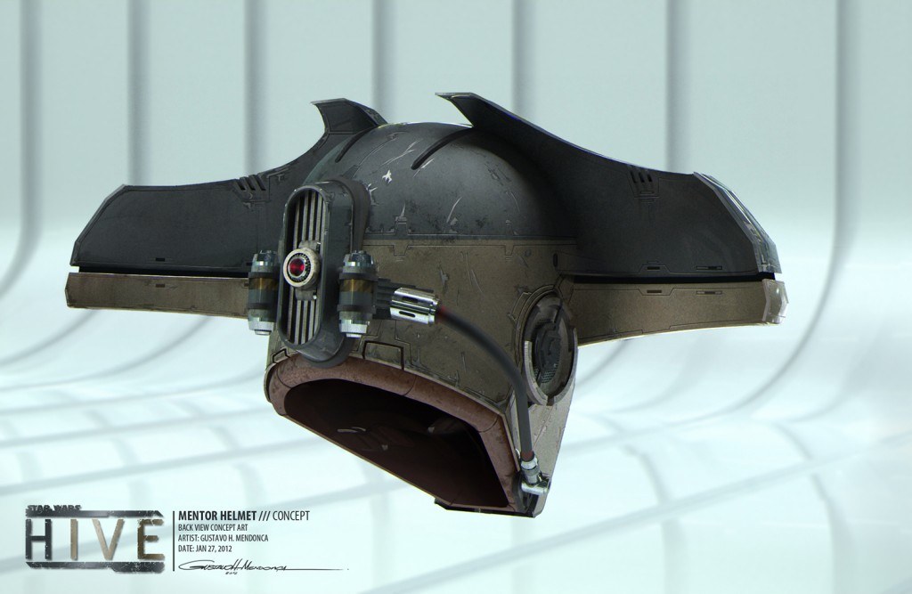
Can anyone think of any similar examples from the EU days? The only thing I could think of was the ‘mentor’ character’s impractically-designed but gorgeously-rendered hammerhead helmet (from the tragically-canceled 1313 game), and one Bane Malar, a far-background character spotted in Jabba’s palace.


I was going to include the exponential increase in exposed zippers in recent titles, but as I’ve already discussed that topic at length in a previous Style Guide installment—and because this entry is getting much longer than I intended!—for once, I’m not going to rehash that argument again here!
Next up at #9 we have asymmetrically detailed garments; another one that fan-makers have really leaned into, to varying degrees of effectiveness. In the OT, pretty much our only examples of garments like this were Han’s Episode IV vest, and the Rebel ‘fleet troopers’ vests – and it took nearly 40 years before we realized how insanely pocketed those were!
The fact that many of these seem to be ‘issued’ uniform pieces is perhaps what rubs me the wrong way the most- especially if we look at the straightforward, well-designed lines of Alliance uniforms in the OT. With characters like Rebel/Imperial pilots and technicians, those did have different pockets on left/right arms, but the torso and legs were the same from side to side; compare that to what seems to be their sequel-analogues wearing these olive-mustard jumpsuits, which apparently are only pocketed on the left side!
Even if we take non-live-action EU sources into account, the general rule of thumb is ‘clothes are symmetrical, and asymmetry comes from accessories.’
(I could go into much more detailed analysis on this one, so let me know if that’s something you’d like to see!)

(Also note that Cad Bane has three separate ‘comm badge’ greeblies on his inner garment (his previously-animated form had zero), which is kinda weird considering they don’t look simply stuck on, but part of the garment – their presence in such numbers just feels contrived, like they’ve been looking to Batuu-bounders for inspiration instead of, I dunno, the Lucasfilm archives?)
Lastly, let’s round out this survey with an even #10, and talk about these two:
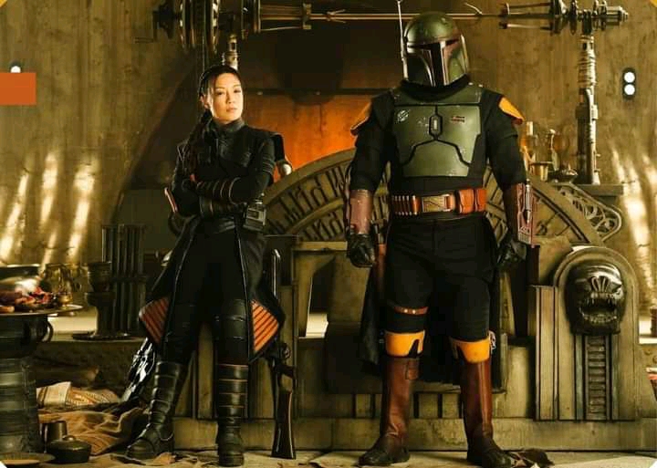
-I’ve touched on it before, so I’m just going to mention it here: the ‘Boba Fresh’ paintjob introduced in Mandalorian Season 2 sticks out like a sore thumb in the ‘used universe’ of the GFFA. Unfortunately, going forward anytime a costumer wants to paint a ‘custom Mandalorian’ or whatever with a similarly pristine paintjob, can now point to Boba Fresh as a reference 😦
However, there’s another thing weird about Boba’s updated look, and it’s one that goes back to one of the foundations of SW character design – black is a color for ‘bad guys’!: “The color scheme basically was the baddies would be black or gray, with the exception of the stormtroopers, and the goodies should be in earth colors” (Mollo, paraphrasing Lucas, in Alinger’s SWCOT, p15).
Considering the prominence that costume-color-as-indicator-of-moral-alignment plays in the OT (Luke starts off as a neophyte wearing white, gets murky in the middle act, and wears black to symbolize the threat of falling to the dark in the third, only for the white to shine through once he passes his test), and that this is reflected in other characters we’ve seen defect or otherwise turn towards the good*, it’s unfortunate that they’ve chosen to dress their ‘reformed’ Boba in all-black softgoods. This gripe also goes for Fett’s new right-hand woman ‘Fennec Shand’ too: if she’s going to go from an underworld assassin to a good guy now, shouldn’t her outfit also reflect this and go up a couple shades? You’d think so, but this is D+ Streaming World, so she’s stuck wearing the same weird black-and-orange getup.
*For example, Starkiller in The Force Unleashed: starts off bad, wearing a dark ensemble; when he turns good, he adds some lighter swoopy bits! Even in the post-Disney titles, the protagonists in Battlefront2!2017 start off as Imperials, wearing black; they defect and get new lighter, Alliance-colored duds. (My dude’s jumpsuit looks dark here but is really more green-gray. Also, why he’s wearing a pilot’s life-support box while running around as infantry, I don’t know – it’s not a particularly well-thought-out design choice, but I digress…


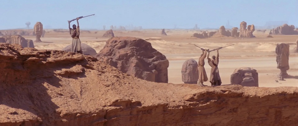
What’s more, Tatooine (where I understand Boba’s solo show was anchored) is the last place you’d want to be wearing black! While it’s not quite true that nobody wears black there, those who do (folks like Bib Fortuna or Garindan), are—wait for it—bad guys! They also happen to be hanging around indoors or in the city, not walking around in the open desert…but look, Boba’s show apparently introduced these variant Tuskens who wear tons of black out. in. the. open. desert.
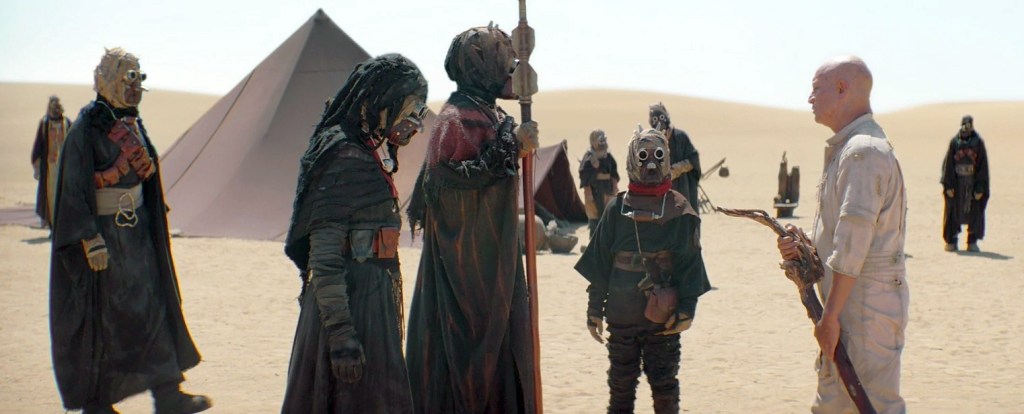
These guys are supposed to be sympathetic characters?? They’re in the DESERT. Alignment aside, you just don’t blend into the natural Tatooine landscape by wearing BLACK. Ughhh. /endrant.
So there you go – ten design elements that seem to have come to the forefront only in the modern post-Disney era! Keeping in mind I’ve only seen a small amount of the modern titles, I’m sure there are other examples besides the few I’ve managed to collect above from the various reference books, so let me know what’s missing and I’ll do my best to add them in!
If your goal is to authentically reenact the GFFA as seen in the texts and references of the nearly four decades of the pre-Disney period, the items above are some things you might try to avoid while designing your kit. I really wish these stylistic deviations were only present in the Disney-released sequel installments, to allow for a clearer delineation between the various eras and let us easily say, “Yeah, that’s just a thing in the new-continuity 30ABYs” or whatever…But alas, as we can see, many of these show up in chronologically-earlier titles as well. If this topic is something folks are interested in, I’d love to do a little more digging and unpacking and see if I can get to the bottom of these departures and how they came to be – so let me know with a comment below if that’s something you’d like to see!
Are there any other changes to the galactic style you’ve noticed were introduced in the last decade? Please come discuss with us at the SWLH facebook group, and thanks for reading!
Researching, writing, and compiling articles like this takes a lot of time and energy. If you’ve enjoyed reading, have learned something from this post, or found it otherwise cathartic, please consider supporting my work via ko-fi, or with a small donation below! Thank you!
Make a one-time donation
Make a monthly donation
Choose an amount (US dollars only – unfortunately, I cannot currently accept Republic credits 😉
Your contribution is greatly appreciated and will help me continue to bring you high-quality content like this post! Alternately, you can support my work via ko-fi as well.
Your contribution is greatly appreciated and will help me continue to bring you high-quality content like this post! Alternately, you can support my work via ko-fi as well.)
DonateDonate monthly
Interesting article. While I agree with some of your points, the issues you have with Boba Fett and to a lesser extent the tribe that had taken him in, I don’t. First off, The “Boba Fresh” look. As you yourself pointed pout in your writeup on The Believer, That is a fresh paint job. and, while you consider it “easy” to say that everything was new once, it is also true. Realistically, weathering and dirt take time to accumulate. If you just painted your armor, it’s going to stand out against more weathered items around it. It also makes perfect sense for him to have freshly painted it after he recovered it, given that the old paint job had been completely obliterated. No soldier is going to leave his equipment in a poor state of repair. And when it comes to armor, this includes maintaining the paint job, and occasionally repainting it. Even in the OT, the Imperial Stormtroopers, soldiers , and officers had pristine uniforms, and also, in the Prequels, Jango Fett’s armor was relatively pristine because he maintained it properly, as he should. Any soldier worth his salt will maintain his gear. This includes the paint. While cosplayers (and movie makers) will intentionally “weather” clothing and other items to make them look more “lived in”, that’s not something a person in the actual setting would do after freshly painting their armor, or buying (or making) a new set of clothes. He or she is not going to just throw them on the ground and “mess them up” just to make them look used. Time, and only time, will do that. And we do see that even with his “fresh” paint job. There are still some chipping minor around the edges where the plates rub together. So that “natural weathering has already begun.
As for the black softgoods, and the black outfits of the Sandpeople tribe. While, to a degree, black may be a sign of the “bad guys”, it is not, and never has been, strictly the case. As you yourself mentioned, Luke Skywalker in RotJ wore black; and while it may have represented his temptation by the Dark Side, even after, he continues to wear black up through the end of the movie, in his appearances in The Mandalorian and Book of Boba Fett, and in The Last Jedi. Even in the old EU comics and book, he continued to wear black in nearly every appearance. He also wore black when he was given his medal at the end of A New Hope. Lando also wore black pants and a black cape (lined with yellow, but still) in ESB, Han Solo wore a black vest in both ANH and RotJ, Black is not “just” for bad guys. It’s just more common for them. And just because Fett may not be a “bad guy” anymore doesn’t necessarily make him a hero. He’s still a morally grey character. He’s still an outlaw, albeit somewhat redeemed. And, remember, when he was a “villain”, he was wearing light grey softgoods. In this case, the Black is what’s showing the turning over of a new leaf, That being him taking on the role of a leader. This is because, Black can also be a sign of leadership, since it is an intimidating color. it denotes strength. And, in Mandalorian culture, Black represents Justice. Thus, it makes sense for him to wear it as someone taking on the role of a “just ruler”.
As for the Tusken tribe wearing black in the desert, Believe it or not, people do wear black in the desert. Even in the Middle East, people do wear black. Women’s Burkas are almost universally black. Mens robes can be black or white. So, it’s not unheard of even in reality. From a visual perspective, it makes that tribe distinguishable from the generic “background” Tuskens we see in the movies too. It says to the audience that these Tuskens are important to the story and not just your run of the mill Tusken. Thus, it makes sense to make them stand out from the rest of their kind. It also shows that not all Tusken tribes are the same, that each tribe has its own traditions and aesthetics. It’s good world building.
LikeLiked by 1 person
Just dropping by, but while there are absolutely real-world desert peoples who wear black, their clothing is almost universally going to be loose and flowy. When you have loose, moving cloth, the color doesn’t really matter, as the movement of the cloth causes ambient air to wick away any additional heat that it might absorb by the sun. I actually read a paper on this a while back, and black and white clothing has the same effect when it comes to what reaches the skin.
But that’s for loose, flowy fabric. Cloth that drapes and moves. Burkas and robes are loose and flowy, moving and shifting with the breeze. The Tuskens, noticeably, are only somewhat wearing flowy clothing. The Prequel-era Tuskens seem to be in robes, from what I can tell, but we see some Disney-era Tuskens in pants and close-fitting clothing. In the image above, we see a youth with a pants + shirt combo. If your clothing cannot move with the breeze, then the color absolutely matters.
Making the Tusken group visually distinct has a purpose, but it could have been accomplished by use of color accessories or accents. Or if they wanted to use black, to have the clothing be less form-fitting. In a desert environment, loose and flowy is the way to go.
LikeLike
I agree; though, as you alluded, his clothes are still loose and billowy, not tight and form fitting. So, even if the child is wearing pants (I agree, not the best option) they are at least loose and flowing, allowing for the air flow you mentioned.
LikeLike