Welcome to another installment of our ‘Galactic Style Guide counterpoint’ subseries, where we help you strengthen your ‘Star Wars eye’ by highlighting and remedying common faux pas that can make your kit look Not Star Warsy. As part of the GSG, the ultimate goal is still to help you create a more accurate ‘outer persona’ – but we approach the goal from the opposite direction!
This month, we’re taking a look at a design phenomenon that’s big on the Disney side of things (whether it be in films made under them, things sold by them, or costumes worn by fans while visiting them) but which was only ever a minimal part of the ‘Star Wars aesthetic’: text on stuff!
The fact that we went six films with zero non-technical Aurebesh (and the first two, most seminal films had NONE at all) should tell you everything you need to know: when it comes to Aurebesh on kit items, it’s always superfluous.
With that in mind, I want to look at some examples to illustrate why you’re better off omitting Aurebesh entirely. Out of respect for the SW costuming/maker community, I’m focusing on publicly-available items sold by Disney, but the point is still applicable: even when executed correctly it’s still largely* unnecessary, and—if used at all—should act as a garnish, not a side dish – let alone the main course! If your impression is relying on Aurebesh to make sense, something’s not working and it might be time to go back to the drawing board.
*As we saw before, pretty much the only folks we saw wearing Aurebesh pre-Disney are prisoners and biker-gang types. Occasionally we see small identifiers like ‘crew’ or ‘staff’, but these simply serve to demonstrate the wearer’s membership in a group as separate from the public.
For a refresher on examples of places where we do commonly see in-universe lettering, check out this GSG entry.
Let’s start off with a couple items featuring completely redundant Aurebesh additions. Did you ever notice that all the top brass at the Death Star’s conference room had matching drinkware?

Here’s the version sold at Galaxy’s Edge:

The same goes for this ‘First Order’ datapad case – sold as a leatherbound journal at the park:

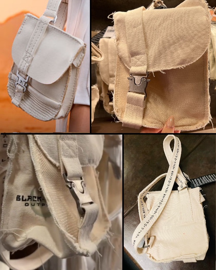
Then there’s this ‘Rey’ satchel sold at the park, which looks…fine…except that of course it’s got park branding and a shoulder strap covered in repeating ‘force wielder’ Aurebesh:
These products make me wonder: who does text like this really serve? I don’t think it serves the person who buys the thing; I think it serves the viewer: a shiny mug with an Imperial cog tells you ‘this is a Galactic Empire mug’, but slapping ‘Galactic Empire’ on it lets other folks know ‘this is a Star Wars mug’.
Here’s the thing, though: as soon as you start putting text on things, you immediately open up the possibility of putting BAD TEXT on things. Let’s see some examples!
At one end of the spectrum, we have items which feature text which is technically-correct, but which still has…issues. Exhibit A: this ‘mystery treasure’ blind-box (aka gambling-exploiting gimmick) packaging. While it does say ‘Crimson Dawn’, you’ll notice that the initial Cresh is printed in the red of the surrounding design, with the result that until you take a very close look, it appears to read ‘RIMSON DAWN’ :

Next, we have this Biggs Darklighter-inspired helmet also sold at the parks:
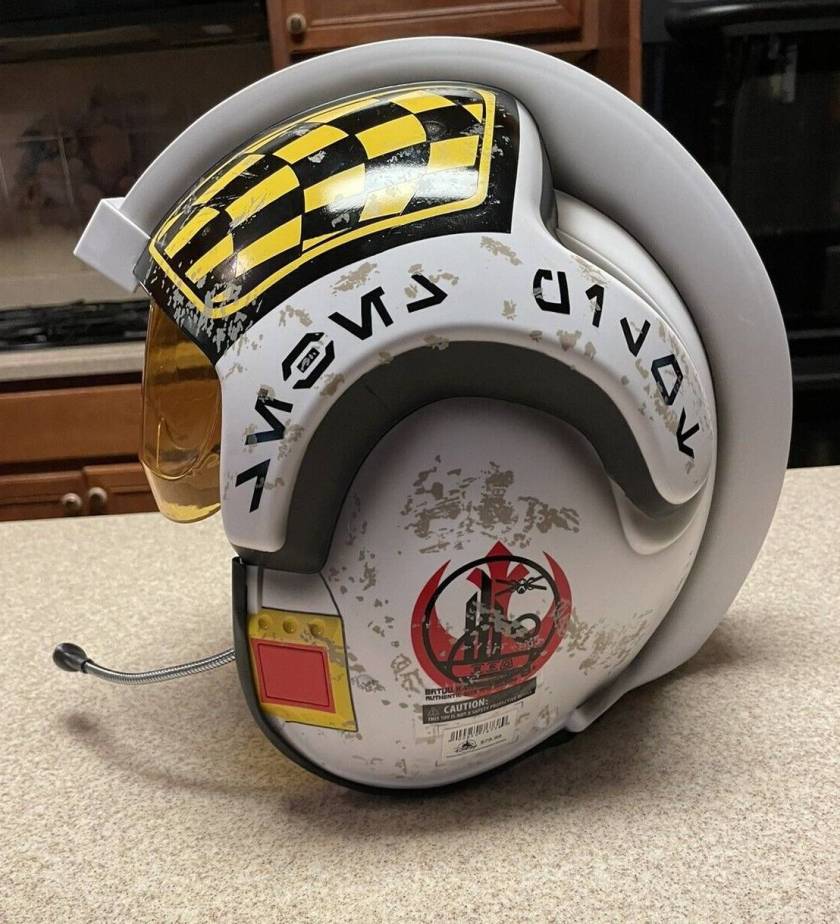
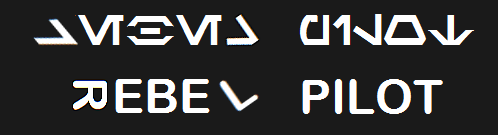
Sure, labeling an obviously-Rebel Alliance helmet ‘rebel pilot’ might be a bit tacky (it is for tourists, after all)…however, this helmet doesn’t quite say ‘rebel pilot’. This is how you would write ‘rebel pilot’ in Aurebesh:

However, since the Resh and Leth in ‘rebel’ have instead been printed at odd angles on the helmet, what we read is more like this:
Then we have items which use correct Aurebesh characters, but still manage to fumble. Check out this ‘Rose Tico half dress’ (an official piece of Disney merchandise, keep in mind)…complete with a missing letter?

The idea of one’s position being indicated by permanent text on one’s clothing has always baffled me. As a militaristic setting, the GFFA would be a thousand times more likely to indicate rank with moveable, easily-changeable insignia instead of text.
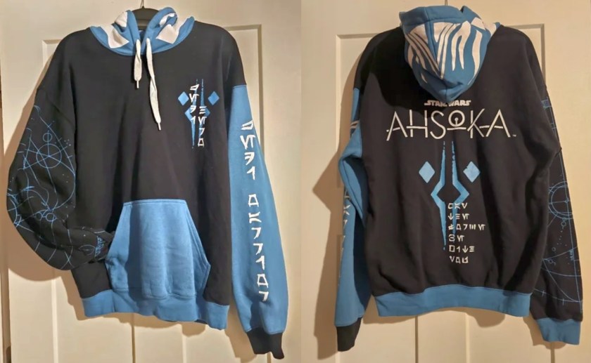
Here’s another example of an officially-licensed offering sent in by a reader, an Ahsoka-show themed hoodie from Geeknet and sold at Gamestop:
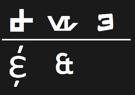
Or take this folding pin, with a rare appearance of an Aurebesh diagraph in the post-Disney era. Normally, I’d be excited, since the diagraphs have never been used much at all, yet alone with any consistency (I have thoughts!). However, the problem is this: there’s never been an ampersand (“&”) in the official Aurebesh character set, so in their attempt to make a “Sanford & Son” homage (for some reason), instead of creating a unique character, Disney instead decided to use the existing diagraph Enth as an ampersand. Of course, as an actual Aurebesh character, Enth already has a meaning, and it’s not “&”:

[Rabbit hole:
Out of curiosity, I pulled up the character map for the three Aurebesh fonts I usually use. Each had a different symbol for &: one more minimal (similar to a ‘crossed Epsilon’ ampersand), one formed by juxtaposing Esk and Trill, (based on the real-world origins of the ampersand as Et (‘and’ in Latin)…and one which used Æ. This ‘handwritten Aurebesh’ font includes the rest of the diagraphs as well (mapped to #, %, *, +, Œ, and Ñ) so I think the association between & and Enth stems from this. I am curious to know if other (more recent) non-handwritten Aurebesh fonts maintain this mapping, and the Disney designers used one of these? I think it’s likely.]
ADDENDUM: “One’s an anomaly, and two’s a trend”:
this helmet from the Disney sequels was reused in the Ahsoka show, and while when the image first came out everyone was wondering why ‘Sabine’ had a helmet that said BÆB, apparently it’s just Disney-Lucasfilm using Enth as an ampersand again. Ugh.

While not dealing with a specific item, I figured this was a good place to bring up this discovery related to perhaps my biggest ‘reenactorism’ pet peeve: reversed Aurebesh characters. We’ve explored the idea of backwards Aurebesh and why it makes no sense before, but since writing those posts I’ve learned that backwards Aurebesh did apparently show up in the Disney park on these ‘lightsaber component menus’…does anyone know if these are still a thing? Or did they get revised and replaced?

ADDENDUM: apparently the reversed letters on the parts menus have since been rectified on more recent offerings:

Hopefully by now my point has been seen: as reenactors and ‘living historians’ of the GFFA setting, we should always strive to represent the setting as faithfully as possible, and adding in-universe text to an item (or by extension, one’s “outer persona”) in order to make it feel more in-universe often has the opposite effect. This reenactorism has been fueled by two main factors.
The explosion in recent years of high-tech, computer-controlled tools like Cricuts, laser cutters, 3d printers, etc., has made it incredibly easy for home crafters to create decals, patches, or text-covered trinkets, while social media enables folks to easily and widely disseminate pictures of said stuff. However, as we’ve written before, the best defense against reenactorisms is simple: avoid fan-art and groupthink, and do your own research!
If you, dear reader, have assembled an impression and think it might need a little Aurebesh to really sell the look, do yourself a favor: take a look through the collected references of the Galactic Style Guide (noting the prevailing absence of text), and ask yourself what that Aurebesh is really for. Will it serve the story of the character/kit you’ve created? Or is it a shorthand way to tell a social media/convention audience “Hey, look, this is a Star Wars costume!”
At the very least, before permanently heat-bonding a snazzy Aurebesh decal to some piece of kit, reach out to your Star Wars online community of choice (r/Aurebesh is a good starting point) and say, ‘Hey guys, does this look right?’ Having another set of eyes can be a big help in spotting typos and other potential pitfalls.
What do you think? Am I being too harsh on Disney’s merch designers? Are there more egregious souvenirs I’ve missed? How would you address the prevalence of Aurebesh items in recent year? Let me know your thoughts below, or come discuss with us in the SWLH facebook community! See you next month!
(Special thanks to this month’s supporters P.D. and R.F.! Researching, compiling, and writing this series takes a lot of time and mental energy. If you’ve enjoyed reading, or have been inspired to be more mindful about your own kit, please consider supporting my work via ko-fi, or with a small donation below! Thank you!
Make a one-time donation
Make a monthly donation
Choose an amount (US dollars only – unfortunately, I cannot currently accept Republic credits 😉
Your contribution is greatly appreciated and will help me continue to bring you this kind of in-depth material!
(Alternately, you can support my work via ko-fi as well.)
Your contribution is greatly appreciated and will help me continue to bring you this kind of in-depth material!
(Alternately, you can support my work via ko-fi as well.)

The phenomenon of flipped characters is often down to fan-made fonts which did this, which means it has been by accident in many cases, and has even been seen onscreen as recently as Andor. I myself was kicking myself when I turned in a graphics commission using one of these fonts and my clients got inundated with questions about the flipped letters by their eagle-eyed customers translating them. Ender Smith should be your go to guy on the history of things like this. Here is the link: https://www.reddit.com/r/aurebesh/comments/glu2i3/inverted_letters_in_aurebesh_an_oral_history/
LikeLiked by 1 person
Excellent, thank you for the link!
LikeLike