
Welcome to another installment of our ‘Galactic Style Guide counterpoint’ subseries, where we help you strengthen your ‘Star Wars eye’ by highlighting and remedying common costuming faux pas that can make an outfit look Not Star Warsy. As part of the GSG, the ultimate goal is still to help you create a more accurate ‘outer persona’ – but we approach the goal from the opposite direction!
Our last two Style Guide entries on jackets concluded with a bit of homework. I wanted us to look at our source examples and pay special attention to the design elements of each jacket, particularly any areas that used different-colored paneling, the placement of any added details, and the overall degree of symmetry. All of these contribute to this month’s theme of “Design”.
As we’ve seen in previous posts, there are several aspects which are commonly seen in GFFA upper-body outerwear and—taken as a whole—contribute to ‘the Star Wars ‘look”’. In addition to a muted color palette, these include:
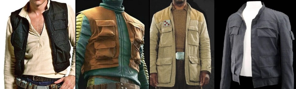

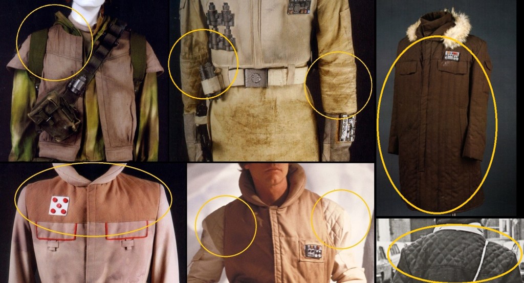
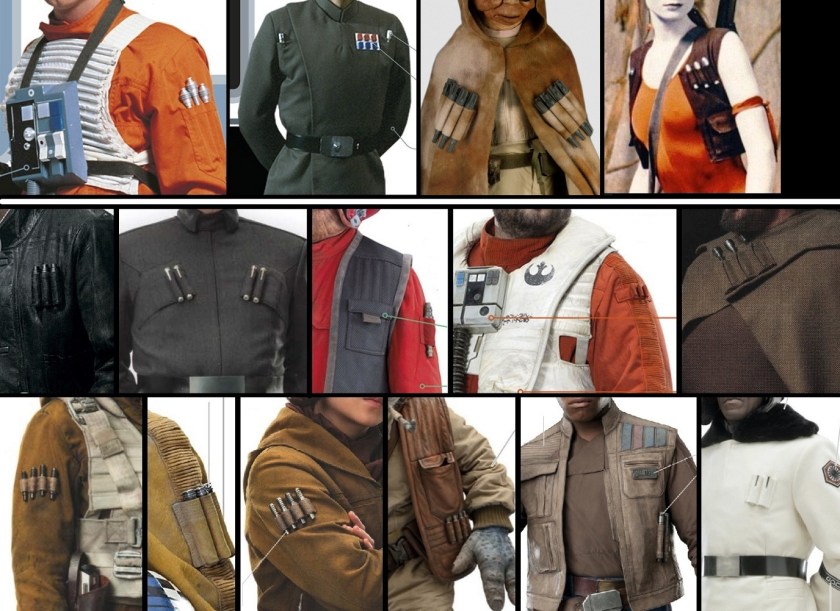


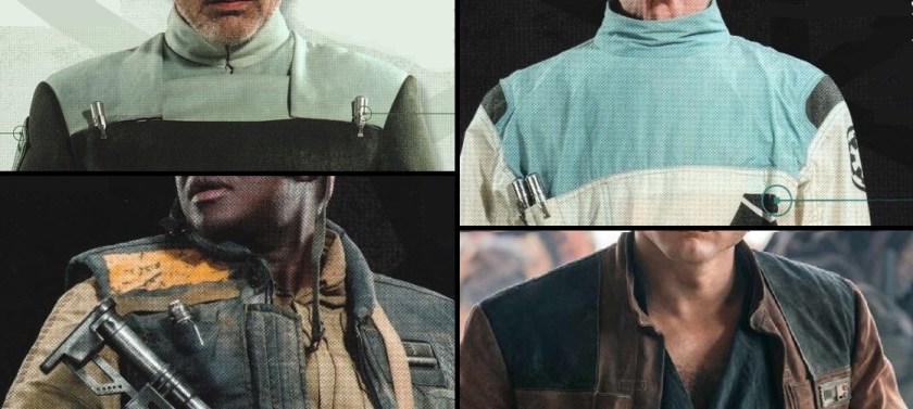
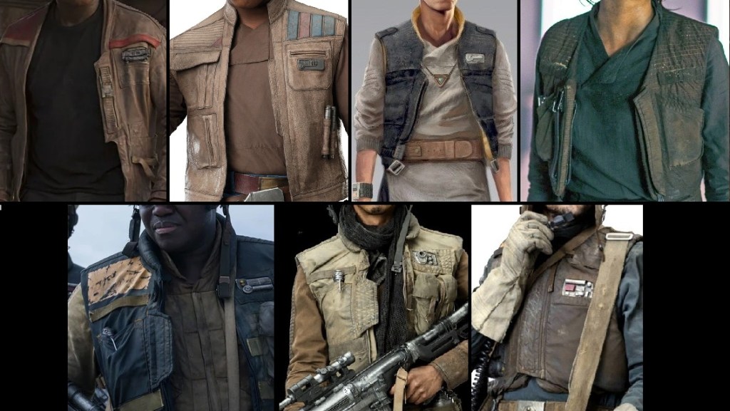
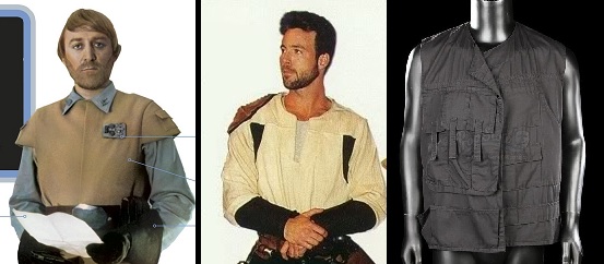
Typically, we might expect to see perhaps three or less of these signifiers per garment. All of them at once, however, is simply silly…Which brings us to Galaxy’s Edge, and Disney’s Original Character ‘Vi Moradi’.
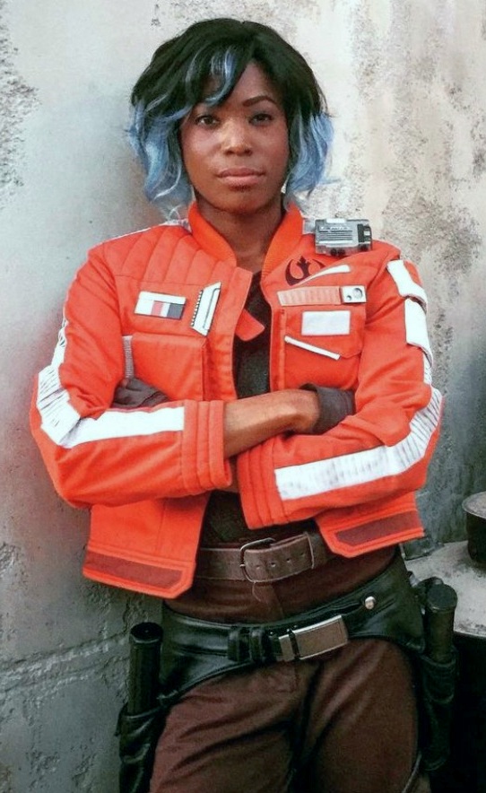
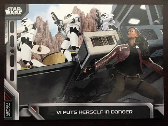
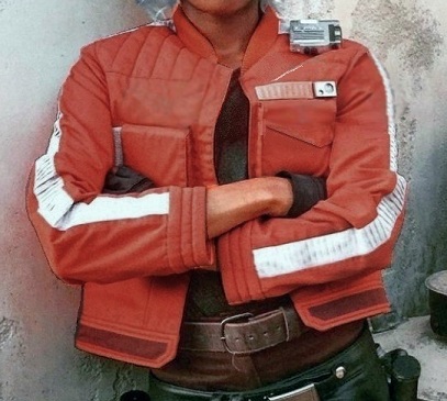
Compared to the examples we’ve laid out above, Vi less resembles a classic or EU Star Wars character and more an animated post-Disney character brought to cosplayed life. Her jacket in particular seems to be a ‘kitchen sink garment’, in that it attempts to include every possible Star Warsy design element at once. Two elements (the conspicuous Alliance starbird and the bright ‘pilot orange’ color) are only seen (within the core continuity) in very specific contexts, and make very little sense given her role as an ostensible spy; presumably they’re contrivances to make her stand out in the environment and make her factional leanings more overt – both serving to facilitate guest interactions. As we can see, the original concept art for the character was quite different:
The numerous other odds and ends attached to the jacket act more as clutter than to serve as any sort of visual storytelling. However, with the application of a little digital devilry, we can attempt to remedy these oversights and see what a more GFFA-authentic Vi Moradi might look like:

As the goal of ‘living history’ (whether historical or fictional) is to accurately represent the style and aesthetic of our given setting or period for educational purposes, if you want to ‘do Star Wars‘ right, then the path is clear: stick to following the common examples, not the exceptions, and K.I.S.S.! – Keep it simple, spacer!
What do you think? Have I overlooked any key design elements in my list? Let me know below, or come discuss the nitty-gritty details of GFFA style at the SWLH facebook community! See you next month!
Researching, writing, and compiling this site takes a lot of time and energy. If you’ve enjoyed reading, have learned something from this post, or will use it as inspiration for your own outfit, please consider supporting my work via ko-fi, or with a small donation below! Thank you!
Make a one-time donation
Make a monthly donation
Choose an amount (US dollars only – unfortunately, I cannot currently accept Republic credits 😉
Your contribution is greatly appreciated and will help me continue to bring you high-quality content like this post!
(Alternately, you can support my work via ko-fi as well.)
Your contribution is greatly appreciated and will help me continue to bring you high-quality content like this post!
(Alternately, you can support my work via ko-fi as well.)

Post-disney era jackets are so derivative, way too busy in most cases and come out looking like the love child of a fishing vest and a five-panel hat. A lot of disney designs are too minimalist when they should be more stylized, and overly maximalist when they need to be subdued. They haven’t quite figured out that sweet spot.
LikeLiked by 1 person