Welcome back to another installment of the Galactic Style Guide (where we break down the ‘Star Wars aesthetic’ in order to help you create a more authentic ‘outer persona’) and the end of Aurebesh Month! In last week’s installment we showed how before the Disney buyout, Aurebesh words on clothing were incredibly rare. This week, we’re taking a look at some places where using in-universe lettering IS appropriate!:

Note that while there are plenty of tattoos in-universe, these were the Only examples of letters-as-body-art I could find in the rather complete listing of Aurebesh appearances.

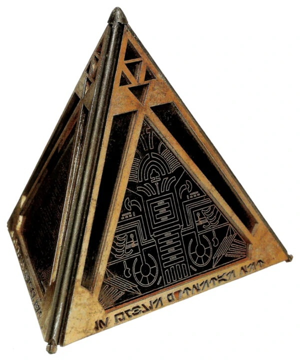
The inscription on this example (In umbris potestas est) is only readable when mirrored horizontally, and then only when viewed from above…see this month’s earlier posts on inconsistent lettering.

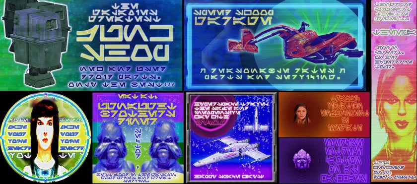
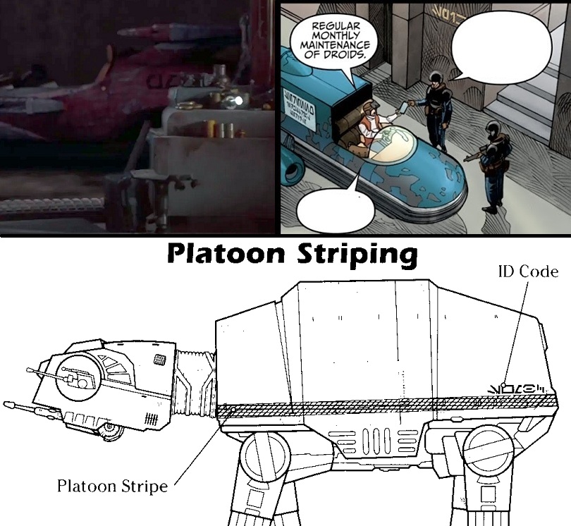
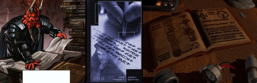
Notice that in our bottom left example, in addition to having some definitely-not-Aurebesh characters, every ‘A’ on the N1’s readout has been horizontally flipped. In this case I think it is unintentional and a result of the artists not being fully familiar with the letters at the time of production (the formalized Aurebesh were only introduced a year or two before).
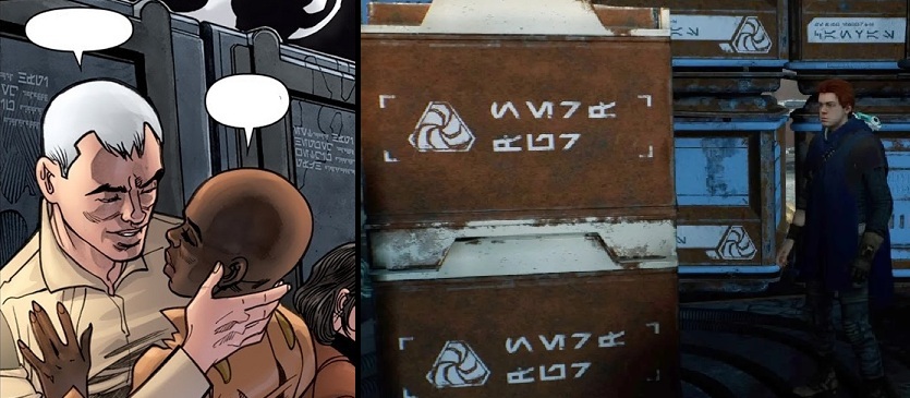
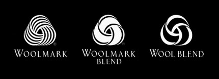
While I’m not sure how I feel about the immense amounts of nerf fur and canvas apparently being shipped around the Galaxy in Fallen Order, I do like that the symbol used is reminiscent of the Woolmark logo for fiber content. Perhaps it would be the perfect design to add to a in-universe wool garment’s tag?
And with that, we conclude Aurebesh Month! (If you missed them, catch up on our first two entries here and here). I hope you’ve enjoyed this deep dive. Are there any categories I’ve left out? Let me know of any prominent examples in the comments below, and I’ll see you next month for another regularly-scheduled edition of the Galactic Style Guide!
Researching, compiling, and writing this site takes a lot of time and energy. If you’ve enjoyed reading, have learned something from this post, or will use it as inspiration for a future project, please consider supporting my work with a small donation below! Thank you!
Make a one-time donation
Make a monthly donation
Choose an amount (US dollars only – unfortunately, I cannot currently accept Republic credits 😉
Your contribution is greatly appreciated and will help me continue to bring you high-quality posts like this one!
(Alternately, you can support my work via ko-fi as well.)
Your contribution is greatly appreciated and will help me continue to bring you high-quality posts like this one!
(Alternately, you can support my work via ko-fi as well.)

The link to the Wookieepedia list of use of Aurebesh is really handy, and a great index to the translations of the material, to quickly see which art directors ensured that their text made sense, or whether they were shoutouts to the artists or just gobbledygook. Most appears to be appropriate to the context (especially anything directed by Dave Filoni), and garbage or shoutouts tend to be found mostly in older video games, card games, and surprisingly enough, the films themselves.
The clearest reference to mirrored capitals is related to the Mysteries of the Sith video game, which I loved and modded for quite some time, but didn’t attempt to translate much. It would be interesting to follow up and see if the online fonts that mirror capitals were released around the same time as the game, and try to determine any causal relationships.
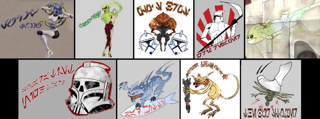
I’m also happy to have the Clone Wars nose art showcased, as the first two cases show a more freehand cursive style. They remind me of southeast asian scripts like Thai.
LikeLike