Welcome back to Aurebesh Month! You can read last week’s entry HERE! When the subject of backwards Aurebesh comes up, oftentimes people like to point to LucasArts games as a source of the flipping confusion. I will admit that there have been many times in LucasArts games where Aurebesh (or another in-universe script) has been seen in a horizontally-flipped orientation. However, this is different from the ‘flipped capitals’ reenactorism…because in these cases the letters aren’t flipped… the entire word is, and there’s an easy explanation.


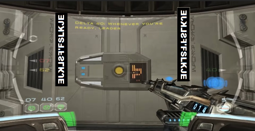
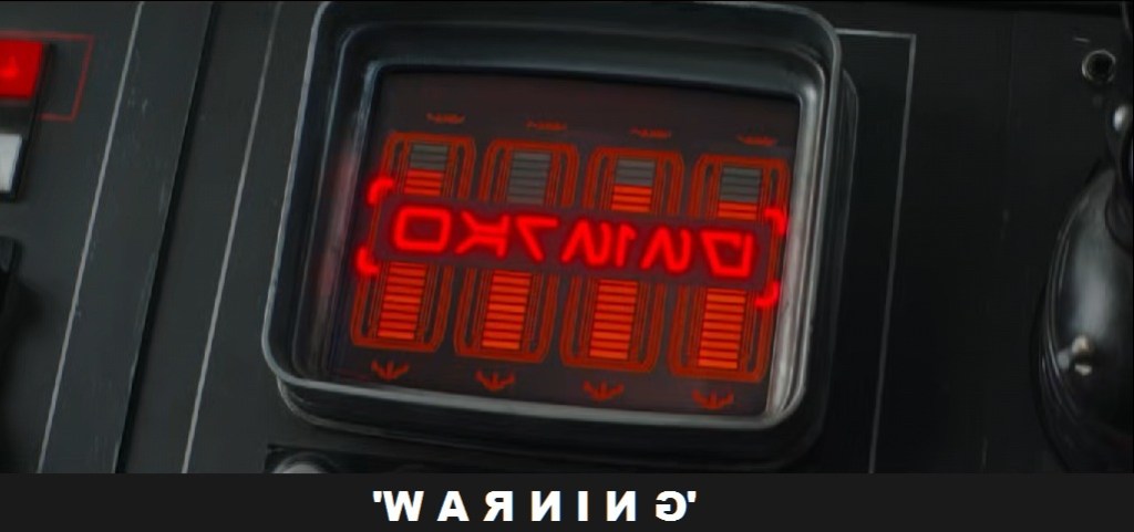
Compare these to the post-Disney letter-by-letter flipping, as seen most prominently in The Mandalorian Season 2:
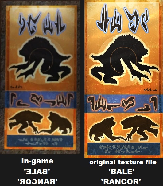
Unless someone wants to make a case that Aurebesh in LucasArts games is meant to be read from right to left, Occam’s Razor says it’s way easier to recognize that the people who worked on these games didn’t have great quality control and didn’t really care about what these letters said. “Game textures get flipped sometimes” is a much better explanation for appearances of backwards Aurebesh letters in pre-Disney materials than ‘flipping individual letters shows capitalization’.
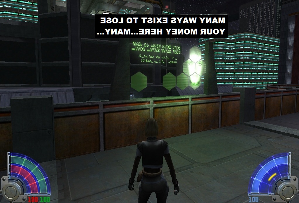
Hell, nine times out of ten, even on-screen, G-canon Aurebesh usually isn’t readable: the letters seen on Coruscant in Episode II are complete gibberish even after they’re correctly oriented:


So, what are we to do about all this Aurebesh craziness? If we treat it like any other reenactorism, the answer is easy: do your research and use common sense! As for why we started seeing flipped letters in post-Disney materials, I’m guessing it’s the same reason we see them on Etsy products – someone used a fan font which included the made-up idea of Capital Aurebesh Letters.
Have you come across any examples I’ve missed? Let me know in the comments below.
Be sure to check in next week for the second half of Aurebesh Month: back-to-back installments of the Galactic Style Guide – Aurebesh Editions! See you then!
Researching, compiling, and writing this site takes a lot of time and energy. If you’ve enjoyed reading, have learned something from this post, or will use it as inspiration for a future project, please consider supporting my work with a small donation below! Thank you!
Make a one-time donation
Make a monthly donation
Choose an amount (US dollars only – unfortunately, I cannot currently accept Republic credits 😉
Your contribution is greatly appreciated and will help me continue to keep this blog ad-free!
(Alternately, you can support my work via ko-fi as well.)
Your contribution is greatly appreciated and will help me continue to keep this blog ad-free!
(Alternately, you can support my work via ko-fi as well.)

You’re absolutely right showing that there are instances in media where the use of Aurebesh is either gobblety-gook just for visual theming, contains hidden messages from the artists, or actually translates into something appropriate for the settings. I agree that it likely goes down to the depth of art direction for the project, or even that part of the project.
The character Mirax Terrik has a jacket logo that was introduced in The Phantom Affair comic book. There is aurebesh writing circling the logo, but not enough detail was put in to make it legible until it turned up in the Star Wars Customizable Card Game. It’s an instance where the font was mirrored, and the translation appears to be a shoutout to the artist working at Decipher Inc, the publisher of the game: http://www.forum.rebellegion.com/forum/viewtopic.php?p=840138#840138
Jedi: Fallen Order which came out recently has an example of gibberish characters on the Second Sister’s circular lightsaber handle (https://starwars.fandom.com/wiki/Second_Sister%27s_lightsaber) as well as some propaganda posters (https://www.videogamesartwork.com/games/star-wars-jedi-fallen-order/imperial-propaganda-5), but the signage throughout at least the first level has been fully translatable and appropriate to the location; the Imperial scrapyard had a lot of posters about surveillance, rooting out rebel sympathizers, and even the signage described the areas correctly. (Yes, you know how I spent an evening when I first started playing it.)
I’m glad to see your analysis of that “Warning” writing from the Mandalorian — I remembered seeing that briefly on screen and thinking it was easier to translate than usual. I think that the characters have been intentionally flipped indivdually to make them match Roman/English letters more closely precisely so they can be more easily read by the common viewer. I know they’ve put attention to their Batuu font that looks like Aurebesh but is fully English, for menus, signage, and merchandise packaging.
LikeLike
Fun tibit about the text below the Aurebesh in the Jedi Academy, Coruscant sign. It’s written in Nal-Huttese, which originally only had the letters A-S. Some of the text is missing, but it says, “O_r _omen are far from decen_ or honorable”
Presumably: Our women are far from decent or honorable
Sources:https://starwars.fandom.com/wiki/Huttese_(writing_system)
https://www.fontsmarket.com/font-details/nal-huttese
LikeLike