Galactic Style Guide – Text

Welcome to another installment of our ‘Galactic Style Guide counterpoint’ subseries, where we help you strengthen your ‘Star Wars eye’ by highlighting and remedying common faux pas that can make your kit look Not Star Warsy. As part of the GSG, the ultimate goal is still to help you create a more accurate ‘outer persona’ – but we approach the goal from the opposite direction!
This month, we’re taking a look at a design phenomenon that’s big on the Disney side of things (whether it be in films made under them, things sold by them, or costumes worn by fans while visiting them) but which was only ever a minimal part of the ‘Star Wars aesthetic’: text on stuff!

The fact that we went six films with zero non-technical Aurebesh (and the first two, most seminal films had NONE at all) should tell you everything you need to know: when it comes to Aurebesh on kit items, it’s always superfluous.
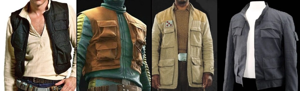
With that in mind, I want to look at some examples to illustrate why you’re better off omitting Aurebesh entirely. Out of respect for the SW costuming/maker community, I’m focusing on publicly-available items sold by Disney, but the point is still applicable: even when executed correctly it’s still largely* unnecessary, and—if used at all—should act as a garnish, not a side dish – let alone the main course! If your impression is relying on Aurebesh to make sense, something’s not working and it might be time to go back to the drawing board.

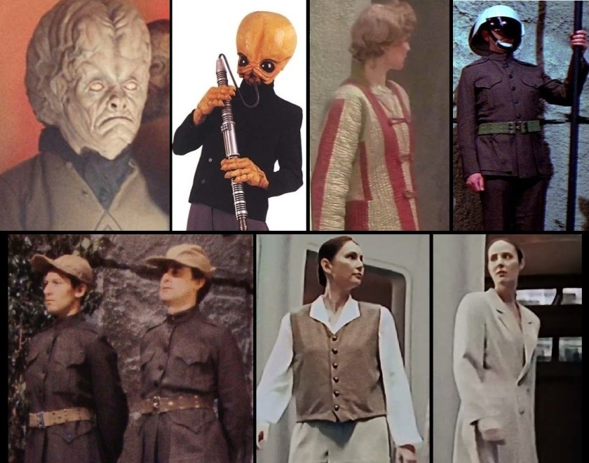
*As we saw before, pretty much the only folks we saw wearing Aurebesh pre-Disney are prisoners and biker-gang types. Occasionally we see small identifiers like ‘crew’ or ‘staff’, but these simply serve to demonstrate the wearer’s membership in a group as separate from the public.
For a refresher on examples of places where we do commonly see in-universe lettering, check out this GSG entry.

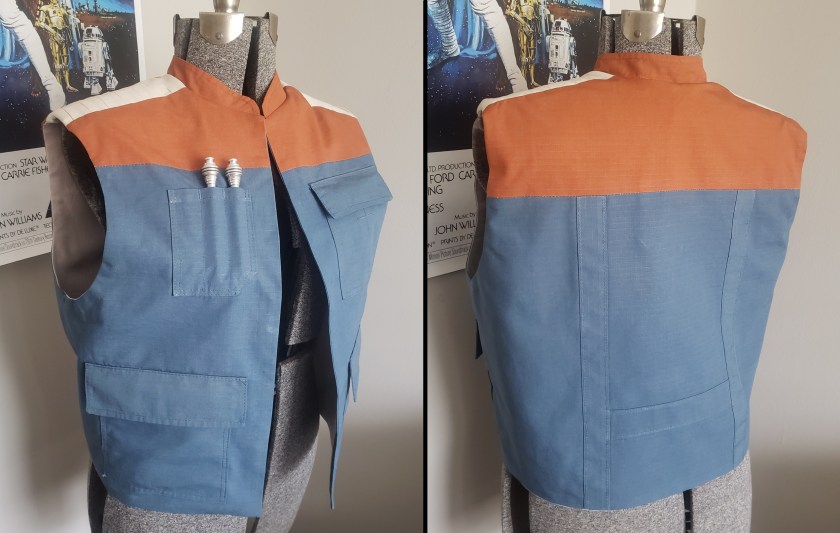
Let’s start off with a couple items featuring completely redundant Aurebesh additions. Did you ever notice that all the top brass at the Death Star’s conference room had matching drinkware?

Here’s the version sold at Galaxy’s Edge:

From one side, it just looks like a slick space-fascist travel mug. From the other side though, it looks like the Empire thinks its officers need to be constantly reminded of who they work for.
more Bad aurebesh products, and how to prevent them!

Galactic Style Guide – Design

Welcome to another installment of our ‘Galactic Style Guide counterpoint’ subseries, where we help you strengthen your ‘Star Wars eye’ by highlighting and remedying common costuming faux pas that can make an outfit look Not Star Warsy. As part of the GSG, the ultimate goal is still to help you create a more accurate ‘outer persona’ – but we approach the goal from the opposite direction!

Our last two Style Guide entries on jackets concluded with a bit of homework. I wanted us to look at our source examples and pay special attention to the design elements of each jacket, particularly any areas that used different-colored paneling, the placement of any added details, and the overall degree of symmetry. All of these contribute to this month’s theme of “Design”.
As we’ve seen in previous posts, there are several aspects which are commonly seen in GFFA upper-body outerwear and—taken as a whole—contribute to ‘the Star Wars ‘look”’. In addition to a muted color palette, these include:

-plenty of pockets (typically with flaps)
striped, ribbed, or pleated sections down sleeves
many more examples within!

Diamonds in the Rough: Max

Welcome back to our monthly spotlight series! In this feature, we talk with Star Wars costumers who help illustrate what high-quality, in-universe costuming looks like, and provide some insights into their character creations!
This time around, we’re looking at two Halcyon cruisers, Max and his wife, about the creation of their excellent smuggler/civilian outfits!

Special shout-outs this month to Doremy and Renee for their generous donations to help out the site – you all rock! 🙂 If you like this series and would like to support my work as well, consider contributing below!

While I personally avoid the divergent creative and aesthetic decisions of the post-Disney era, these outfits are still quite representative of the general galactic style and worth showing off!
read the full interview!

Galactic Style Guide – Buttons

Welcome to another installment of our ‘Galactic Style Guide counterpoint’ subseries, where we help you strengthen your ‘Star Wars eye’ by highlighting and addressing commonly-made costuming faux pas. As part of the GSG, the ultimate goal is still to help you create a more accurate ‘outer persona’ – but we approach the goal from the opposite direction!

Since the earliest designs of Star Wars ’77, one of the main signifiers of GFFA fashion is the absence of visible fasteners—as chief costume designer John Mollo said, “George didn’t want any fastenings to show, he didn’t want to see buttons, he didn’t want to see zips, so we used stuff like Velcro, and things were just wrapped over and tied with a belt…”The Making of Star Wars (J.W. Rinzler), p. 125.
Since this is one of the chief ‘rules’ of Star Wars fashion and comes straight from the top, something like 98% of the outfits seen onscreen abide by this rule. When visible fastenings do show up on screen, eagle-eyed costume-minded folks (or those who really want to cut corners) tend to make a big deal of it….although they really shouldn’t.

buttons onscreen in OT and PT: Pons Limbic, Figrin D’an (and the rest of the Modal Nodes), Rebel honor guard, Yavin ceremony backgrounders, Tian Chyler, Jango Fett, Elan Sleazebaggano
more visible fasteners after the jump

Programming Announcement – 2022

Hello there, readers! As I did last summer, I want to give a heads-up that the next several months will see a change in the pace of material being published here at the Star Wars Living History blog. While I kind of wish this announcement was coming at the start of another long-distance backpacking adventure, the actual reasons for it are still exciting!

Somewhere around the middle of Virginia last fall I decided that when I returned from the Trail I wanted to get into the (small) business of galactic clothing, and this spring launched my Offworld Outfitters brand. At present my product line is limited to in-universe-styled spacer/adventurer’s vests, with plans for other offerings possible down the line. I trust that the previous five years’ worth of posts at this blog will sufficiently demonstrate my commitment to quality and the authentic GFFA style 😉 For those interested in a vest of your own, you can find my vest commission form and more information at the OFFWORLD.OUTFITTERS link above!

So: in order to better divide my time between this venture and some intensive projects for the Middle-earth Reenactment Society, plus for my own mental health (you can experience ‘burnout’ on hobbies, too!), over the next few months you will see me stepping back from publishing this blog on a weekly basis. What this means for you, reader: my recurring series the Galactic Style Guide will continue to drop on the last Saturday of each month, while future entries in our new Diamonds in the Rough interview series will come out on the second Saturday of each month. In between those, I may release other posts on an individual basis as time allows; in other words, as a rule you should expect two posts per month instead of four (or five).
I’m also open to the idea of reader-submitted guest articles, so if you have a fictional-reenacting or GFFA-living-history-related topic you would like to research and report on, please don’t hesitate to click the CONTACT button above and get in touch!

Thank you for reading, and may the Force be with you!

Attention! Your input is needed!

Hello there, folks! We don’t have a regular post for you this week, but believe me that next week will more than make up for it (a triple-header, in fact)!

As I was reflecting recently, I’ve been a maker of Star Wars clothing, costumes, props, and gear for over 20 years! After building and growing my skills for so long, I’ve been thinking it might be time to try and turn my hobby into a small business. So…

To help identify my market and see what potential products people might be interested in, I’ve created a short, anonymous survey, which you can find HERE. Your participation will be greatly appreciated – thank you!

Hiding in plain sight

I talk a lot on this blog about the idea of ‘reenactorisms’ – inaccuracies that get unknowingly (or knowingly!) perpetuated because someone didn’t do their research. Usually when discussing these blunders we’re talking about individuals making them, but I wanted to point out two examples to day that prove the big players are not immune to making sloppy mistakes either!
Following the release of Episode III in 2005, LA’s FIDM (Fashion Institute of Design and Merchandising) hosted the exhibit Dressing a Galaxy, which featured 100 screen-used costumes from Episodes I through VI. From the pictures I’ve seen online it was an absolutely incredible presentation.
However, one tableau of costumes held a glaring mistake for all to see:

Anything seem ‘off’ about this?

If you can’t spot it, maybe we’d better check the references:

The scene in question
Continue reading “Hiding in plain sight”

Galactic Style Guide – Viewscreens and Datapads II

Happy Christmas everyone, and welcome back to the Galactic Style Guide, the monthly series where we break down the ‘Star Wars aesthetic’ in order to help you create a more accurate ‘outer persona’! In this month’s installment (our final post of 2021!) we’re wrapping up our look at those ubiquitous pieces of ‘hard kit’, datapads and viewscreens. While datapads have really taken off in the last couple years (since visitors to the Galaxy’s Edge parks started kitbash-decorating phone cases), if you’re only familiar with them from fanmade creations, you may be surprised to see that the MANY visual examples we have from licensed sources are detailed very differently!

From an in-universe visuals sense, these three examples are perhaps the most accurate homemade ‘datapads’ I’ve seen yet. What is it that makes them so well-done?

Continue reading “Galactic Style Guide – Viewscreens and Datapads II”

Galactic Style Guide – Viewscreens and Datapads I

Welcome back to the Galactic Style Guide, the monthly series where we break down the ‘Star Wars aesthetic’ in order to help you create a more accurate ‘outer persona’! For this installment, we’re taking a look at devices which seem as prevalent in the Galaxy Far Far Away as smartphones are here on Earth. While a comlink fulfils the role of a telephone (audio-only), a datapad or viewscreen fills the niche of a tablet computer, and is used to display or swap visual information (but not to make ‘calls’).

While datapads have really taken off in recent years (after visitors to Galaxy’s Edge started kitbash-decorating their phone cases), if you’re only familiar with them from these fanmade creations, you may be surprised to see that the MANY visual examples from official sources are designed very differently! This post will be primarily concerned with the general design of these devices’ screen sides, and then next month we’ll pay special attention to the rear face, to which so many would-be Batuu-bounders glue so many greeblies.

Continue reading “Galactic Style Guide – Viewscreens and Datapads I”

Galactic Style Guide – Aurebesh I

Welcome back to Aurebesh Month and our first of two installments of the Galactic Style Guide (where we break down the ‘Star Wars aesthetic’ in order to help you create a more authentic ‘outer persona’) taking a look at something that’s become really popular among the Batuu-bounding community in recent years: using in-universe Galactic Basic lettering—the Aurebesh—on kit items.

I see folks incorporate Aurebesh words into their clothing so often, it inspired me to do some digging and see how many examples I could find from the various visual media sources.
The first instances I found are all a certain segment of the galactic populace that I don’t think I’ve ever seen re-created before, but which would make for an excellent living history impression:

PRISONERS: from Agent of the Empire—Hard Targets and Empire: The Wrong Side of the War

I was a little disappointed that these guys are just wearing yellow/orange jumpsuits, and that there wasn’t a little more consistency between them and the more interesting prisoner uniform of the Imperial Remnant in 12 ABY (Jedi Outcast):

And speaking of Jedi Outcast

more examples of aurebesh on clothing after the jump