Galactic Style Guide – the Post-Disney era (part 2)

Welcome back to another installment of the Galactic Style Guide, the series where we break down the ‘Star Wars aesthetic’ in order to help you create a more authentic ‘outer persona’!
Like last time, this entry is a bit of a departure from our usual collection of references. This time we’re continuing to focus on elements which I’ve identified as either clear deviations from what existed in the Lucas days, or which originated firmly in the post-Disney era. Let’s keep it moving with #6!

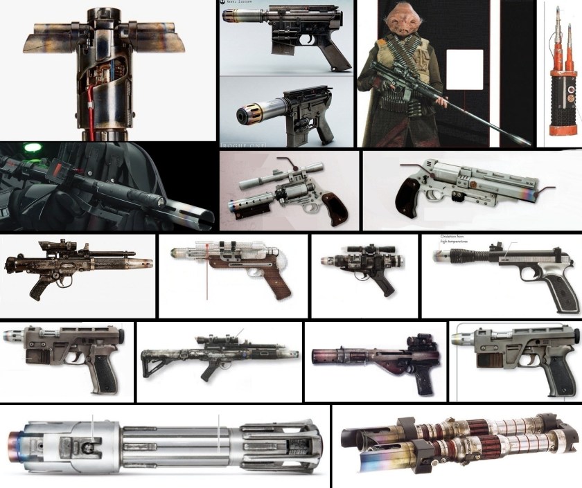
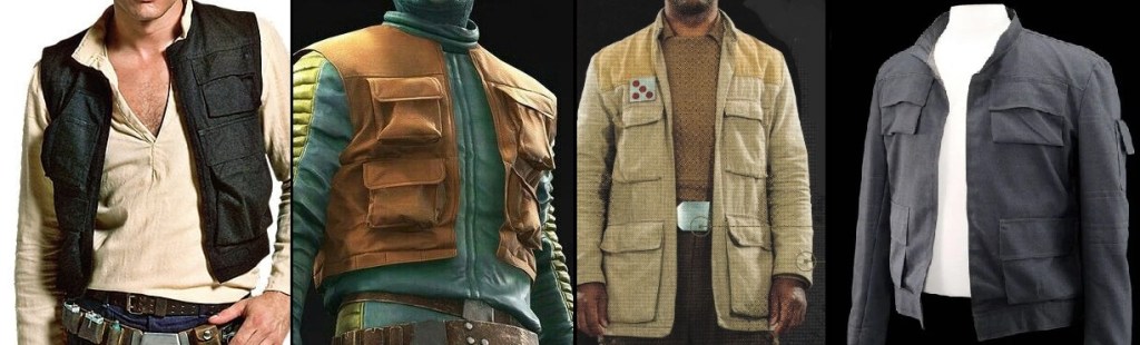
When it comes to soft kit, after perusing the various Visual Dictionaries one trend I noticed started appearing with the Sequels and subsequently latched onto by fan-makers is that of little discrete loops (instead of pockets) being used to hold various doodads on clothing – your code cylinders, ‘mini flares’, blaster ammo, etc.:

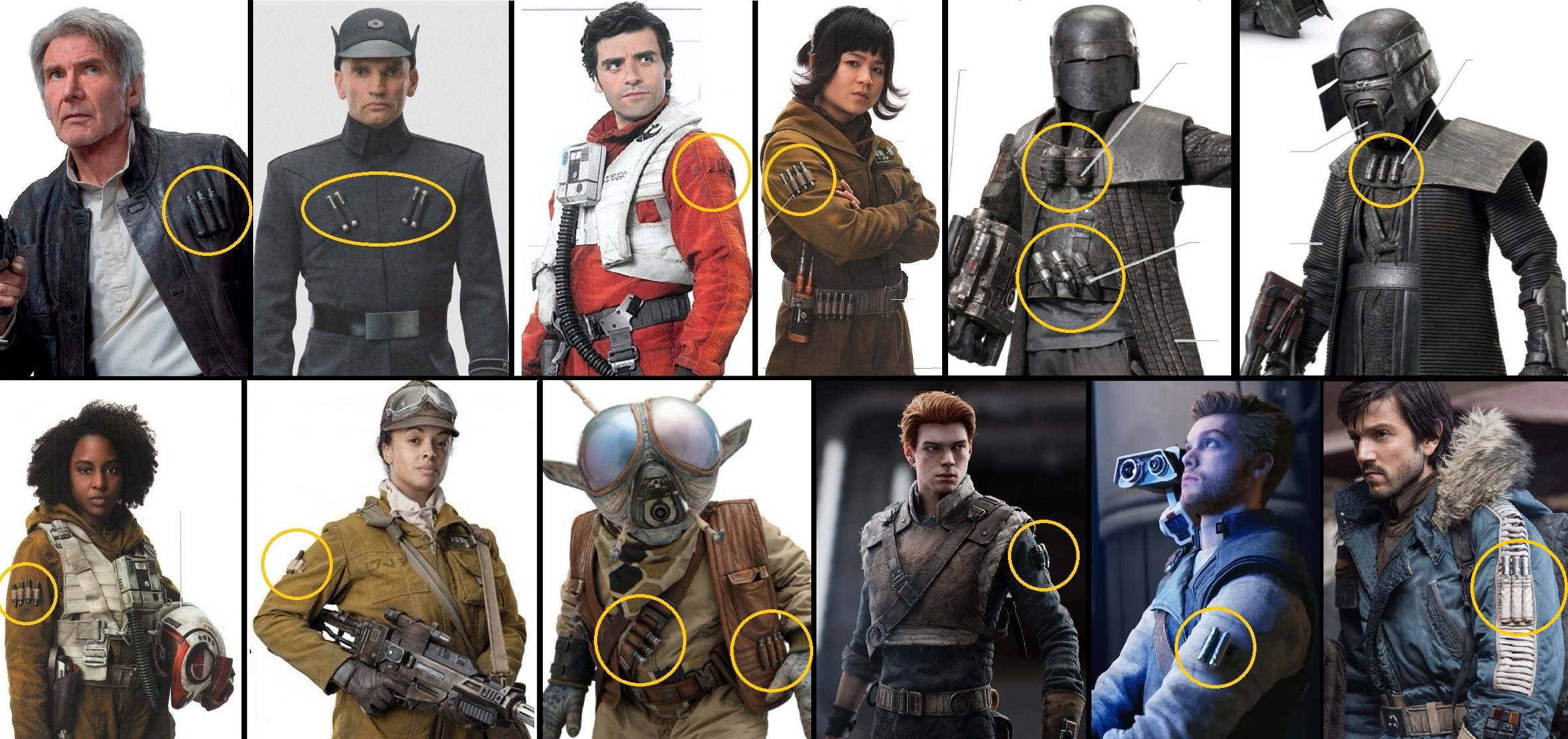
What I really want to know is why everyone in the new continuity seems to need so many of these little silver things anyway? In the OT, we’d see Rebel pilots and technicians with small ones on their belts, and big ones kept below the knee (Reb pilots and Bossk seemed to be just about it). But in the Disney era, they’re all over the place! In short, I think they’re a symptom of the new era costumings’ general reliance on overdesign, versus good design, which in the case of the Star Wars setting, usually boils down to Less is More. You don’t need to have every single visible surface sporting some sort of detail – it’s OKAY for costumes to have ‘blank space’! This is especially true in our crispy 4k UHD+ present, when it is all too easy for an overdesigned outfit to leave the viewers’ eyes overwhelmed.

Keep reading for more observed abberations!

Galactic Style Guide – the Post-Disney era (part 1)

Welcome back to another installment of the Galactic Style Guide, the series where we break down the ‘Star Wars aesthetic’ in order to help you create a more authentic ‘outer persona’!
And now, for something completely different. If you’ve been following this site, you may have noticed that the majority of my references come from live-action sources of the Lucas era. However, as we inexorably continue further from the boundary between that period and the current one, it becomes clear that not only did this modern era come with a new continuity, but a noticeable shift in visual aesthetics as well, and I want to explore elements of this shift as they relate to our pursuits here (recreating the Star Wars galaxy in ‘reenacting’ form!). In this post (and at least one more!), we’re looking specifically at some elements which I (coming from a relatively outside perspective) have identified as either clear deviations from what existed before, or which originate firmly in the post-Disney era. You’ll see what I mean.
I’m not doing this ‘countdown’ style, but when it comes to something we got along without perfectly fine and was unequivocally not present in the pre-Disney days, #1 at the top of the list has to be the presence of the tempering rainbow on the muzzles, emitters, or tips of blasters, lightsabers, or tools:

I read somewhere that all the Remnant TKs in Mandalorian also feature this, but the scenes are so dark it’s hard to tell.
Keep reading for more observed abberations!

Galactic Style Guide – Zippers

Welcome to another installment of our ‘Galactic Style Guide counterpoint’ subseries, where we help you strengthen your ‘Star Wars eye’ by highlighting and remedying common faux pas that can make your kit look Not Star Warsy. As part of the GSG, the ultimate goal is still to help you create a more accurate ‘outer persona’ – but we approach the goal from the opposite direction!
This month, we’re taking a look at one of the specific elements which George Lucas decided would have no place in his Star Wars aesthetic – zippers! (For our look at the other form of visible fastener Lucas specifically didn’t want to see, see this previous entry).

If I were to ask you when you first learned that Lucas didn’t want to see zippers and buttons onscreen, there’s a very good chance it was sometime after 2014 and the release of Brandon Alinger’s excellent SW Costumes – The Original Trilogy. However, the no-visible-fastener rule had already been in print for at least seven years: discussed in Rinzler’s The Making of Star Wars (2007), on page 125. What accounts for the delay before this fundamental GFFA costuming rule became truly widely known is, I think, social media; Facebook was still in its relative infancy in 2007. Since then however, the top-down Lucas directive has become frequently-cited in costuming circles, and yet cosplayers and Batuu-bounders still try to excuse visible zippers in their costumes; typically, this involves pointing to a screenshot of Luke Skywalker zipping up his flightsuit in Episode V:

Remember, per our sources, Lucas said he didn’t want to see such fasteners, not that they didn’t exist at all (many seem to have trouble with this distinction). Why Luke’s zipper (and presumably, those of all the other onscreen pilots and technicians) is perfectly permissible is simple: once worn, it isn’t visible – it’s hidden by a flap! (If you can think of a way to convey a pilot suiting up for battle by donning a one-piece flightsuit without showing them zipping it up, I am all ears!) However, there are a fair number of other characters whose costumes do include uncovered zippers: luckily for us, these tend to fall into one of two categories; unluckily for us, things seem to have taken a step backwards in the modern era…

keep reading for plenty of examples from the lucas and disney eras!

Galactic Style Guide – Text

Welcome to another installment of our ‘Galactic Style Guide counterpoint’ subseries, where we help you strengthen your ‘Star Wars eye’ by highlighting and remedying common faux pas that can make your kit look Not Star Warsy. As part of the GSG, the ultimate goal is still to help you create a more accurate ‘outer persona’ – but we approach the goal from the opposite direction!
This month, we’re taking a look at a design phenomenon that’s big on the Disney side of things (whether it be in films made under them, things sold by them, or costumes worn by fans while visiting them) but which was only ever a minimal part of the ‘Star Wars aesthetic’: text on stuff!

The fact that we went six films with zero non-technical Aurebesh (and the first two, most seminal films had NONE at all) should tell you everything you need to know: when it comes to Aurebesh on kit items, it’s always superfluous.
With that in mind, I want to look at some examples to illustrate why you’re better off omitting Aurebesh entirely. Out of respect for the SW costuming/maker community, I’m focusing on publicly-available items sold by Disney, but the point is still applicable: even when executed correctly it’s still largely* unnecessary, and—if used at all—should act as a garnish, not a side dish – let alone the main course! If your impression is relying on Aurebesh to make sense, something’s not working and it might be time to go back to the drawing board.

*As we saw before, pretty much the only folks we saw wearing Aurebesh pre-Disney are prisoners and biker-gang types. Occasionally we see small identifiers like ‘crew’ or ‘staff’, but these simply serve to demonstrate the wearer’s membership in a group as separate from the public.
For a refresher on examples of places where we do commonly see in-universe lettering, check out this GSG entry.

Let’s start off with a couple items featuring completely redundant Aurebesh additions. Did you ever notice that all the top brass at the Death Star’s conference room had matching drinkware?

Here’s the version sold at Galaxy’s Edge:

From one side, it just looks like a slick space-fascist travel mug. From the other side though, it looks like the Empire thinks its officers need to be constantly reminded of who they work for.
more Bad aurebesh products, and how to prevent them!

Galactic Style Guide – Design

Welcome to another installment of our ‘Galactic Style Guide counterpoint’ subseries, where we help you strengthen your ‘Star Wars eye’ by highlighting and remedying common costuming faux pas that can make an outfit look Not Star Warsy. As part of the GSG, the ultimate goal is still to help you create a more accurate ‘outer persona’ – but we approach the goal from the opposite direction!

Our last two Style Guide entries on jackets concluded with a bit of homework. I wanted us to look at our source examples and pay special attention to the design elements of each jacket, particularly any areas that used different-colored paneling, the placement of any added details, and the overall degree of symmetry. All of these contribute to this month’s theme of “Design”.
As we’ve seen in previous posts, there are several aspects which are commonly seen in GFFA upper-body outerwear and—taken as a whole—contribute to ‘the Star Wars ‘look”’. In addition to a muted color palette, these include:

-plenty of pockets (typically with flaps)
striped, ribbed, or pleated sections down sleeves
many more examples within!

Galactic Style Guide – Aurebesh I

Welcome back to Aurebesh Month and our first of two installments of the Galactic Style Guide (where we break down the ‘Star Wars aesthetic’ in order to help you create a more authentic ‘outer persona’) taking a look at something that’s become really popular among the Batuu-bounding community in recent years: using in-universe Galactic Basic lettering—the Aurebesh—on kit items.

I see folks incorporate Aurebesh words into their clothing so often, it inspired me to do some digging and see how many examples I could find from the various visual media sources.
The first instances I found are all a certain segment of the galactic populace that I don’t think I’ve ever seen re-created before, but which would make for an excellent living history impression:

PRISONERS: from Agent of the Empire—Hard Targets and Empire: The Wrong Side of the War

I was a little disappointed that these guys are just wearing yellow/orange jumpsuits, and that there wasn’t a little more consistency between them and the more interesting prisoner uniform of the Imperial Remnant in 12 ABY (Jedi Outcast):

And speaking of Jedi Outcast

more examples of aurebesh on clothing after the jump

The great Twi’lek mix-up

I’ve explored the idea of Reenactorisms—the acceptance and perpetuation of an innaccuracy—several times before, but it is worth pointing out that these are not limited to fan creations: official resources can still fall into the pit.
Work on this month’s Style Guide post got me thinking about a key confusion in the depiction of the Twi’lek species: males have ears, but what do females have? The past 20+ years of visual sources suggest they all have cones where their ears should be, but prior to the release of The Phantom Menace in 1999, Twi’lek females most definitely had ears! We can trace the source of this confusing inconsistency by noting the examples of ‘cone’ or ‘ear’ as they appeared in order of release.

1983: Oola—the first depiction of a female Twi’lek—is green. The cones on Oola’s headdress are clearly white, and are also clearly part of the headdress, not protruding from within it.

January 1995: art development/pre-production begins on Episode I

Continue reading “The great Twi’lek mix-up”

Avoiding the Perils of Reenactorisms!

As I closed a previous ‘prop philosophy’ post last year I said, “If research and authenticity aren’t kept at the forefront, it is all too easy to fall into the pit of reenactorisms…” However, I realized that while I refer to the concept here from time to time, the term reenactorism may not be well-known to the average reader, so I wanted to use a post to explore what reenactorisms are, their pitfalls, and a few examples from the history of Star Wars.
So: what does the word mean? F.L. Watkins, writing in The Reenactor’s Encyclopedia (2004), describes reenactorisms as practices or items which are “incorrect and have no documentation but are commonly believed to be correct and are widely used”. In other words, it’s when one reenactor copies another reenactor’s mistake—acting under the assumption it is accurate—and thereby perpetuates an inaccuracy. Almost always this is the result of not doing one’s own quality research and assuming others have. A reenactorism is the Costumed Arts version of the ‘telephone’ game, where one person whispers a phrase to their neighbor, who whispers what they (mis)heard down the line, usually mutating the phrase with each iteration and becoming unrecognizable by the end. Whereas those playing the game could easily check if the phrase being passed down is correct by asking the speaker, ‘What did you say?’; in reenacting, we can prevent reenactorisms by asking for evidence or documentation.

For example…quick: what color is a standard Rebel Fleet Trooper’s helmet? If you said ‘White’, consider this:

Continue reading “Avoiding the Perils of Reenactorisms!”

Galactic Style Guide – Hats III

Welcome back to another installment of the Galactic Style Guide, where we break down the ‘Star Wars aesthetic’ in order to help you create a more Galaxy-accurate ‘outer persona’! This month we’re finishing up our brief survey of in-universe head coverings.

In my research into space-archeology clothing styles, I found the wide-brimmed, low-crowned style seems more common on the galaxy’s fringes, and is more likely to be worn by bounty hunters, settlers, explorers, treasure hunters, and the like. As I discussed previously, this style draws on visual archetypes of Spaghetti Western gunslingers and Pulp Serial archeologists, although our two final examples (both Naboo) seem to buck the trend, and instead invoke the more pastoral petasos of the Classical Greek traveler.

Wide-brimmed hats: Jacobi Sterne, Outer Rim Marshal (FFG Far Horizons), female archeologist/treasure hunter #1, female archeologist/treasure hunter #2; Rodian fringer/explorer; Nico Okarr, Cad Bane; Levet (Duro archeologist), Theed citizen (22 BBY) who appears to be carrying (in addition to a large striped bag) a wide-brimmed (straw?) hat; ‘the artist of Naboo’ (SW Visionaries).
read more

Thoughts on ‘The Rescue’

Aaaand just like that, I think I’m done. Erm, I meant…Welcome back to my commentary series on Season 2 of The Mandalorian; for this installment we’re breaking down the Season 2 finale, Chapter 16 ‘ The Rescue’.

We open with Slave 1 chasing a Lambda-class shuttle, and wasn’t it nice to hear those high-pitched lasers again? We see the inside of the shuttle, and it was amazing how much more open the cockpit feels versus what we saw in Episode VI—is it something to do with being widescreen, depth of field, or is the set here just twice as big? It just feels like we’re seeing two totally different ships to me.

Continue reading “Thoughts on ‘The Rescue’”