Welcome to another installment of our ‘Galactic Style Guide counterpoint’ subseries, where we help you strengthen your ‘Star Wars eye’ by highlighting and remedying common mistakes that can make an outfit look Not Star Warsy. As part of the Galactic Style Guide, the ultimate goal is still to help you create a more accurate ‘outer persona’ – but we approach the goal from the opposite direction!
As I teased last time, we’re going to be working with at an excellent tool for helping us see the ‘Star Wars look’ in action: Mando Creator . This handy bit of coding lets users create their own two-dimensional Mandalorian outfit by customizing every element in terms of design, color, and decoration. If you’ve used Bitmoji, HeroCreator, or similar avatar-making tools, it’s pretty easy to get the hang of. I’d never played with it before, and in 20 minutes I had made up my own hypothetical Mandalorian kit!:

One of the coolest parts—at least for the purposes of training our ‘Star Wars Eye’—is the Armor Gallery feature, where we find (in addition to a few novelty designs and face characters like Din Djarin and the Fetts) a wide variety of completed assemblages submitted by other users.
While their success at nailing the in-universe look can be hit-or-miss, these fan-submitted Gallery examples are also customizable, which means they can be tweaked and brought more in line with the galactic aesthetic.
When it comes to that aesthetic, it’s clear one person with a solid grasp of it is Brian Matyas, who served as a chief concept artist on The Mandalorian; here’s a small gallery of his work (published in The Art of The Mandalorian) to see what I mean:
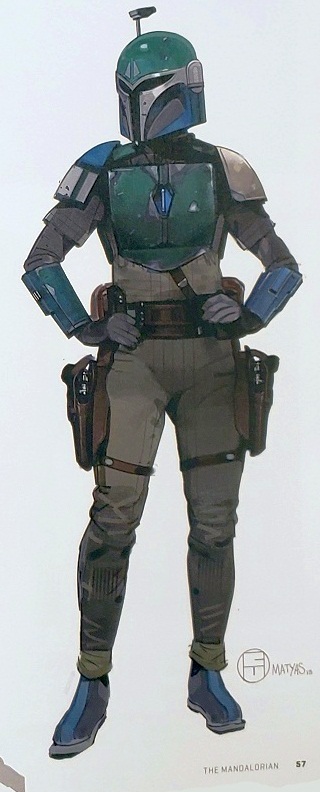
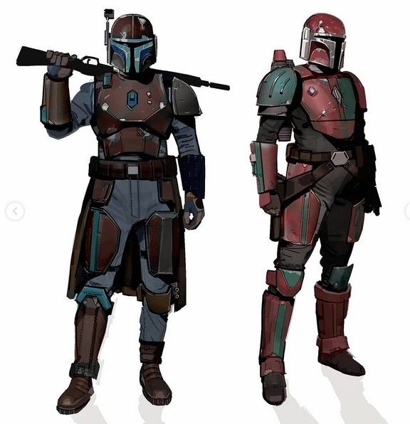


I hope you’ll note that while the colors of ROYGBIV are fully represented, none are bright – as we would expect for authentic, in-universe characters!
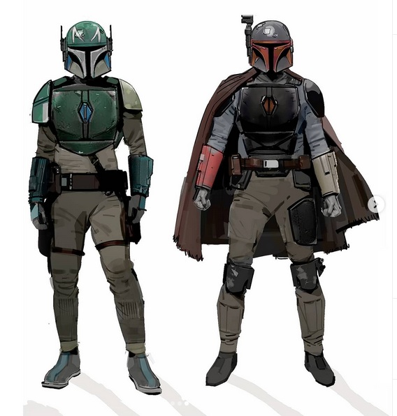
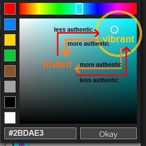
Now, let’s choose a fan-made example from the Mando Creator gallery and see if we can’t make it more look like Matyas’ work.


Even still including the goofy ‘trauma plate’ outlining, a big improvement is made simply by toning down the colors. How did I do this? If we click on the color box, we can see MandoCreator’s palette tool; when designing a character, the further left and down one picks a color, the less vibrant and garish the color will be, thus contributing to a more accurate in-universe look. This trick can be applied any character or outfit you’re designing (excepting canonically-brightly-colored classes like X-wing pilots or Royal Guards): give it a try the next time you’re picking colors for your own ‘OC’!
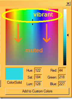
the color palette in GIMP (and I believe Photoshop as well?) is set up the same way; for folks who are old-school like me and still use MSPaint (right), you’ll find your muted colors by moving downwards.
Before we end, I’d like to touch on another unfortunate color choice I frequently see costumers (especially Mando ones) make: overuse of the color black.
From its earliest days, Star Wars‘ color scheme has essentially been “baddies would be black or gray, with the exception of the stormtroopers, and the goodies should be in earth colors” (Alinger, SWCOT, p15). For characters who should ostensibly be neutral parties following the credit$, a surprising number of Mandalorian Merc Costume Club members are apparently Dark side-leaning, at least based on their clothing choices! In addition to making a character ‘read’ as a ‘bad guy’, it is fairly difficult to make plain black fabric show age and weathering, compared to lighter colors. (Outside of full-sun settings, black also doesn’t photograph well, and even then it’s tricky).
While black soft goods may be easy to obtain and ‘edgy’ or ‘tactical’, it’s well worth the time and effort to pursue an alternative; note, for example, that Matyas’ concept Mandos above wear grays with faint hints of brown, blue, and red.
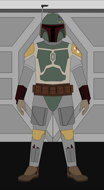
Let’s close by seeing what would happen if we applied both of today’s Obstacles To Authenticity to the galaxy’s most notorious bounty hunter? What would he look like with more saturated armor and dressed in black?
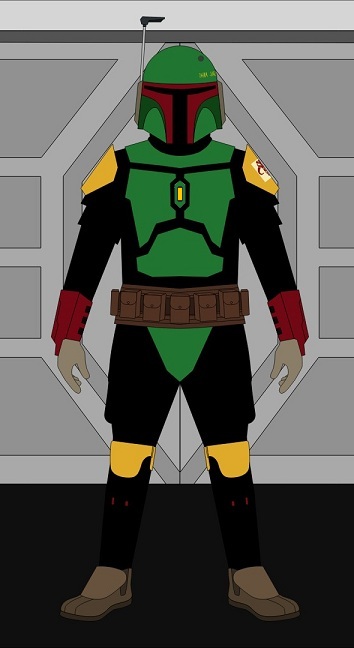
Oh. I see. Well, then.
Join us in two weeks for another spotlight interview!
Writing and compiling this blog takes a lot of time and energy. If you’ve enjoyed reading or have learned something from this post, please consider supporting my work with a small donation below! Thank you!
Make a one-time donation
Make a monthly donation
Choose an amount (US dollars only – unfortunately, I cannot currently accept Republic credits 😉
Your contribution is greatly appreciated and will help me continue to bring you quality content like this post!
(Alternately, you can support my work via ko-fi as well.)
Your contribution is greatly appreciated and will help me continue to bring you quality content like this post!
(Alternately, you can support my work via ko-fi as well.)

3 thoughts on “Galactic Style Guide – Color II”